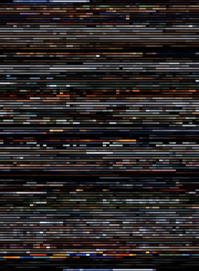
Colours of the Incredibles
Pixar make some stunning movies. You could complain that their stories are pretty basic but from a visual standpoint, there’s no disputing their beauty.
One thing I love about these movies is the amount of effort that goes into choosing the colour palette for the movie. Yet, because of the speed of the action, this work barely even get noticed.
So what would it look like if we strip out the “image” from these images, and leave only the colour information?
I used the Incredibles for this experiment because it’s my favourite Pixar movie so far. Incidentally, there’s an “Art of the Incredibles"-sized space on my bookshelf, in case anyone feels like filling it for me.
(click on image for higher-res version - 960 * 1308 px, 186.5KB)
 johnke.me