Just the facts, ma'am
Use Stylish?
Read The Irish Independent?
Hate that site’s article page design?
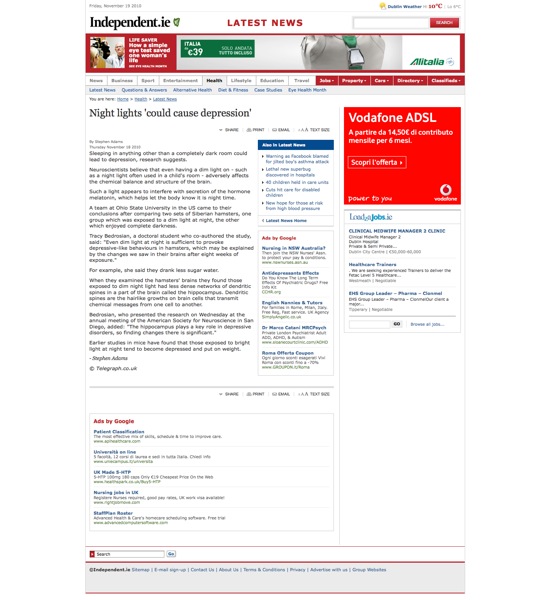
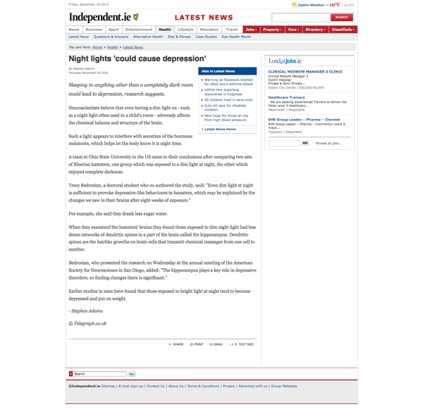
Me too. So I wrote a simple (11 lines of actual CSS) user style for the article page which, to my eyes anyway, improves the experience of using that site. I changed the font family and size, changed the line height, italicised the first line of the article to make it more of a lede. Oh, and I also yanked the google adverts. I guess this is slightly rude, since, y’know – global economic crisis and all, they probably need the advertising cash – but seriously, there’s more advertising space than article space. That’s just bullshit.
I didn’t touch any of the main landing pages because I hardly ever go to the site directly, I just go to the articles from my RSS reader.
Before:

After:

You can grab the userstyle here.
 johnke.me